Disclaimer:
|
|||||||||||||||||
New Futhork Font
This font is a "canon" version of the Star Wars alphabet known as "Naboo Futhork", which appears in the Star Wars prequels, notably The Phantom Menace.
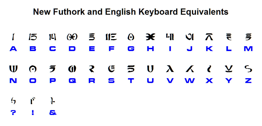
This font includes all letters, the ampersand (&), question mark, and exclamation point. (In the current version 0.5, there are no numbers, and most punctuation is missing.) Note that there is no difference between uppercase and lowercase letters. Also, kerning has been enabled for this font (see "What is kerning?" on my Fonts FAQ page for a discussion of kerning). Here's a full table of New Futhork letters and their respective keys.
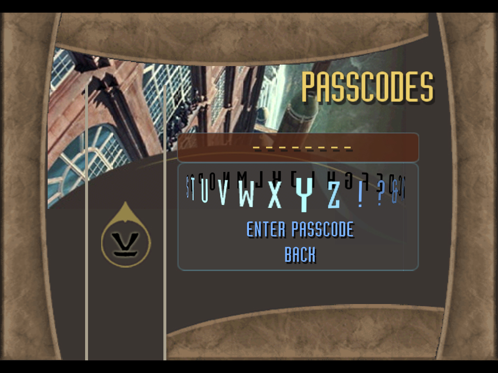
Accuracy of This FontMy source for this font is the passcodes screen for the "Battle For Naboo" game released in 2000 by LucasArts. The passcodes screen displays all letters, along with the ampersand (&), question mark, and exclamation point. Here's a sample screen.
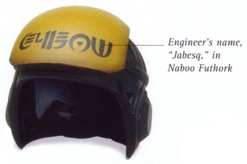
The version of Naboo Futhork that some people may already be familiar with was created by Omega Design. The main drawback to Omega Design's version is that it does not include all letters. Also, and perhaps even worse, it fell victim to misinformation presented in the Episode I Visual Dictionary. (FYI, I initially contacted Omega Design about updating their font using the info I discovered, but they never responded. So that's why I made my own.)
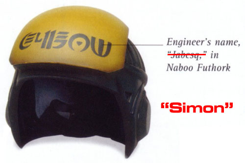
In case you didn't know it, the Visual Dictionaries have a tendency to present things that are, well, less than 100% accurate. They often have to re-create props in order to give them more details. Sometimes they make things up (see my Sith Prophecy font page for more info on the version of Vader's chest box created for the Visual Dictionary). Anyway, my point here is not to bash the Visual Dictionaries, but just to plant some little seeds of skepticism. So now things get interesting. If we use the letter mappings from the "Battle for Naboo" game, we actually don't get "Jabesq" at all. You might think we get some jibberish, but in fact we get "Simon". What are the odds of this actually translating into not just a word, but a name?
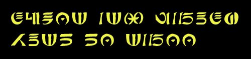
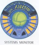
So which scenario is more likely? 1) The helmet actually says "Jabesq", and LucasArts made up their own version of the font to use on an obscure passcodes screen? Or 2) LucasArts got the official version of the font from LucasFilm, but the Visual Dictionary decided to fib about the name on the helmet, since "Simon" is not a very Star-Warsy name? Wait, I have more. We can also find the following graphic from the Episode I Visual Dictionary.
Using the letter mappings from the game, the two large words in the center of the display are "Yo WARREN". Again, unless we have the correct letter mappings, what are the odds of randomly getting a shout-out to a friend? For me, this proves that the LucasArts letter mappings are the correct version. If you're not convinced, well, at least you have a cool free font to play around with. Enjoy!
|
This
page last modified on
6/10/2008
Return to Top