Disclaimer:
|
|||||||||||||||||
Sith Prophecy Font
This Star Wars font is based on the writing that appears on Darth Vader's chest box. NOTE: This is version 2.1 of the font, updated with recent discoveries about the Return of the Jedi chestbox.
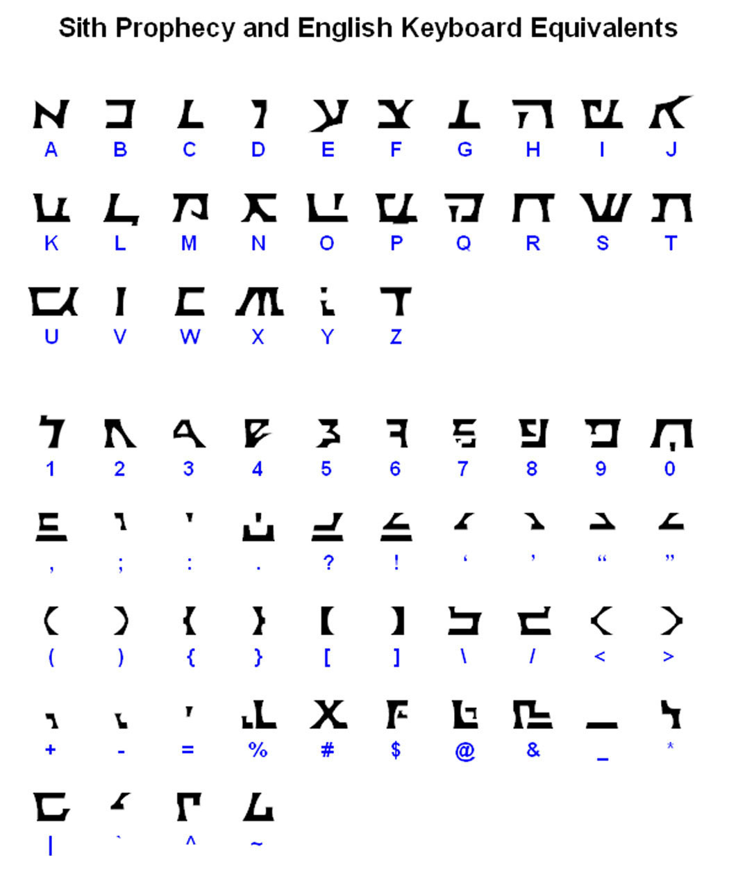
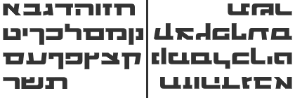
This font includes all English letters, numbers, and common punctuation marks (basically, all the stuff displayed on the keyboard). Uppercase and lowercase letters are identical. Also, kerning has been enabled for this font (see "What is kerning?" on my Fonts FAQ page for a discussion of kerning). Since the inscription on Vader's chest box appears to be written in Hebrew (more on this below), I've attempted to give the letters a Hebrew styling and map them - as much as possible - according to their Hebrew values. Here's a full table of Sith Prophecy letters and their respective keys.
Accuracy of This Font(You folks might want to grab a snack. This is going to take a while.) This was not a font I had originally planned on making, but once I realized all the variations of chest boxes, I was pulled in by the mystery. There are three great reference sites I've come across in doing my research:
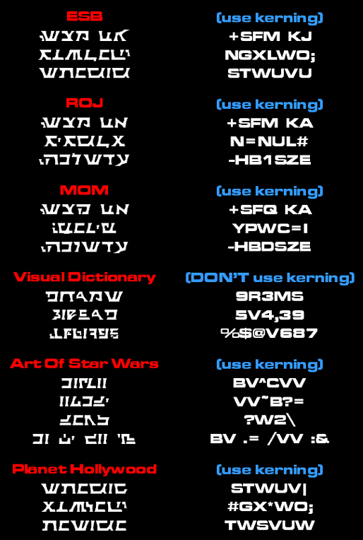
The text that appears on the chest box in The Empire Strikes Back was different from the text on the Return of the Jedi version. (There was no text on Vader's chestbox in A New Hope.) In addition, several other versions have cropped up over the years, all of which were created or modified after the original movies were made. In all, I've found six different versions of the chest box text. My font allows you to re-create all six of these versions. I'll go through each of these below.
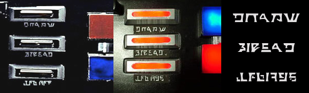
Empire Strikes BackFor the ESB version, there's Kurtyboy's great (big) publicity photo that clearly shows the text used. I consider this the only 100% screen accurate version of the text.
Interesting thing to note: The last line in this version is identical to text that appeared on the Magic of Myth Speederbike.
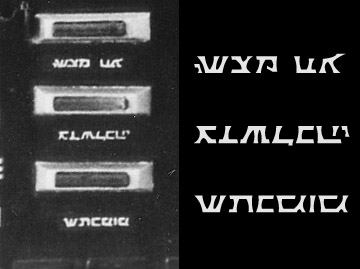
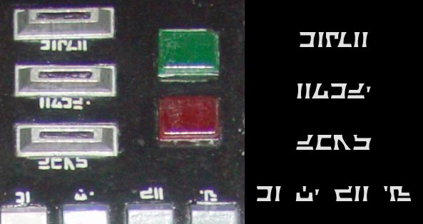
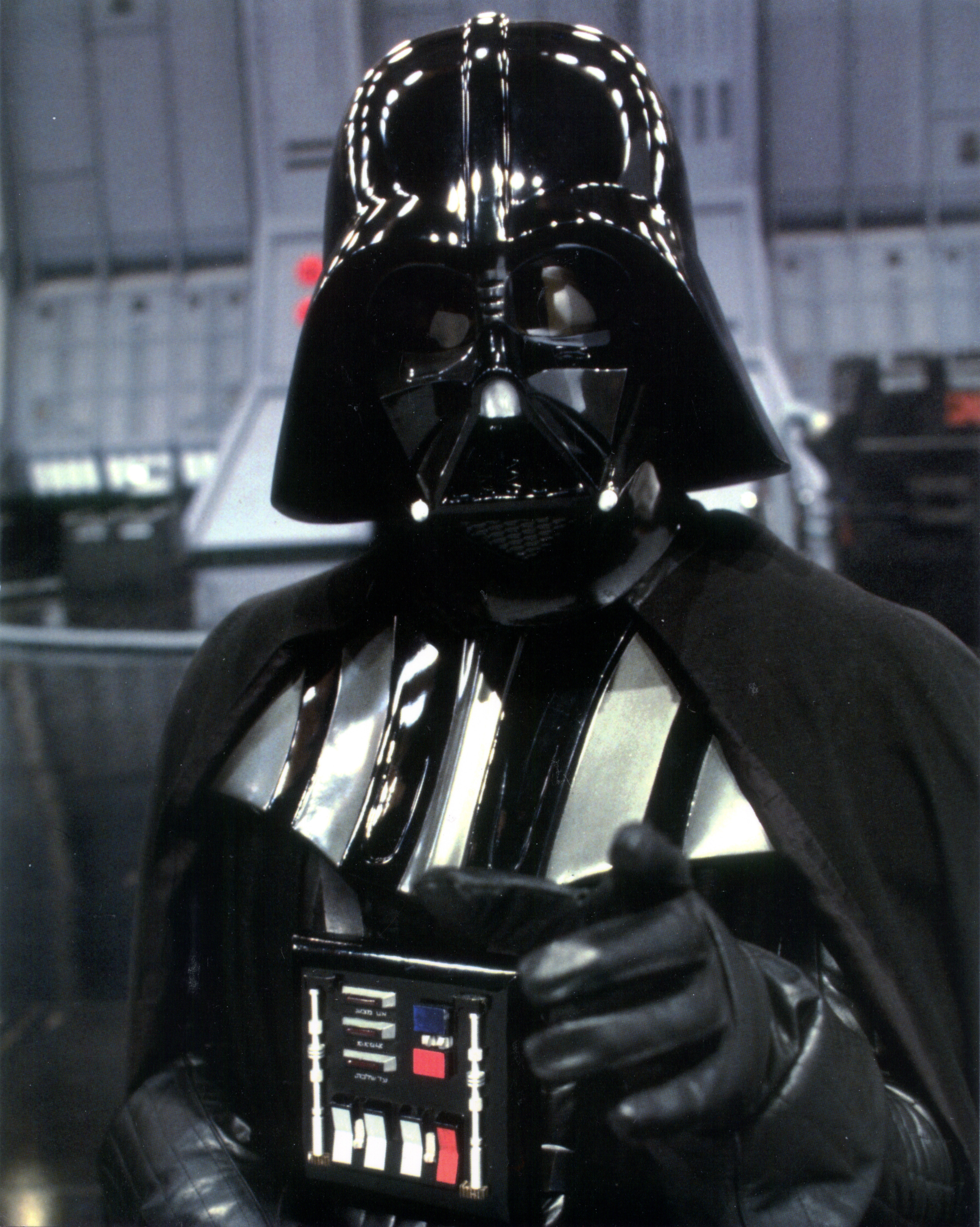
Return of the JediIt's taken some time, but I've finally tracked down a decent image that shows the text from Return of the Jedi. It's the famous Vader pointing photo taken in the Death Star docking bay. The image is a little unclear, but due to the similarity of the Magic of Myth version below, I'd say my interpretation is almost definitely spot on.
If you look closely at the ESB and ROJ versions, you'll see that the first lines are exactly the same except for the last letter. Also, the last line in the ROJ version is actually the middle line from the ESB version, flipped upside-down and changed slightly. Magic of MythThe most "popular" version of the chestbox in recent years has been the Magic of Myth version - "popular" because people were free to walk right up to the display case and get really detailed pictures of the costume. For a while I believed this to be the same as the ROJ version, but now that I've seen the "Vader Pointing" photo, I can now see that the middle line of text is definitely different. This chestbox was probably created especially for the exhibit, but it's pretty obvious that it's "supposed" to be the ROJ version because of the similarity.
Darth Jones over at the RPF said this about the MOM version: "The top and bottom bars of writing are the same as in the movie but the middle one looks a little different. Could be a cannibalized ESB box. The middle lettering looks like ESB. The top and bottom writing here are the same as in the 'pull my finger' photo from the Death Star docking bay in Jedi." Although the middle line, in my opinion, doesn't seem to bear a resemblance to anything from the ESB box, my findings agree with Darth Jones on this one.
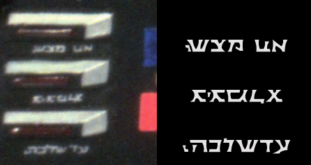
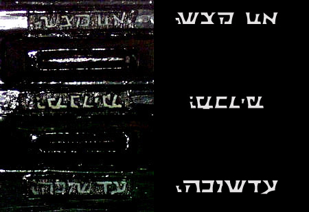
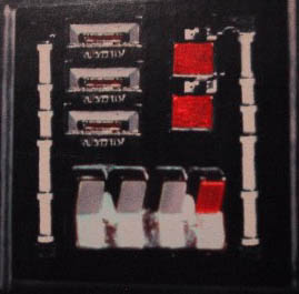
Star Wars Visual DictionaryThe version of the chestbox that appears in the Visual Dictionary is unlike the ESB or ROJ (or MOM) versions. The first line of this version can also be seen on the cover of Star Wars Insider #39 - here's a close-up. Furthermore, this text appears on the lifesize Vader mannequin by Rubies and the chestbox prop sold by Galaxy Trader (now defunct). This seems to be the version favored by many Vader costumers.
Ex-ILM employee Darth Jones says about the Visual Dictionary Version: "(It) looks to be a box made after all of the films... The lettering looks much like an echo of the lettering 'used' on versions I worked on while at LFL. It echoes the names of those who made the particular suit. For instance, Don Bies worked on these and the middle bar of writing says essentially 'BIES AD.' Maybe his middle name starts with an 'A.' The bottom one has 'LFL' and so forth. Ya think I'm pushing it? - There was one box up there that actually said Don Bies, Amy (I forgot the last name), and someone else. It was on display at the Los Angeles County Museum of Art for a short while." This sounds like an excellent analysis to me. Starwars.com states that Don Bies has worked for ILM since 1987, and in 1988 he became the official Lucasfilm archivist, and "helped organize the first major exhibition of Lucasfilm memorabilia for the 1988 Marin County Fair". Starwars.com also states that Bies "created props for the Dorling-Kindersley books the Star Wars Visual Dictionary and the Star Wars: Episode I Visual Dictionary". Some have said that the last line may read "LFL 1995", meaning the prop was "restored" by LFL in 1995. So I guess you could say this version is "official" but not screen accurate.
Art of Star WarsJust as the Magic of Myth exhibit toured the US, there was an exhibit that toured the UK called the "Art of Star Wars". The Vader that appeared in this exhibit had a very unusual chest box. It was the A New Hope version (with the green button), but it also had text on it, with the unique addition of text above the 4 rocker switches. The text is not movie accurate and was obviously added to the chest box at some later time. Also, the lettering does not really resemble the pseudo-Hebrew used on the rest of the chest boxes.
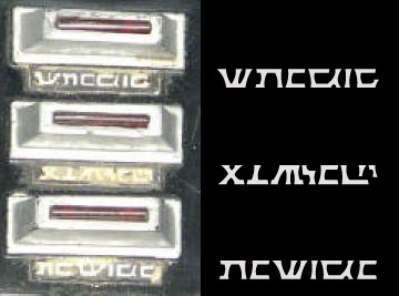
Planet Hollywood / NetherlandsThe final version I've seen is from the Planet Hollywood restaurant in Las Vegas. DarthBlade has told me that this version has also been spotted in the Netherlands. I've never been to Planet Hollywood in Las Vegas, so it's possible this is the same suit which has now moved to the Netherlands.
Notice how the first and last lines contain the same letters, just re-ordered. Also, there are some striking similarities between this and the ESB version. First, the middle lines are almost exactly the same. Second, the last line in the ESB version appears here as the first line, except the last letter has been trimmed slightly. Due to the similarity, my guess is that this is a reconditioned ESB box.
Other Official Versions?I'm sure there are other versions out there; I just haven't seen them. Think about how many copies (hero & stunt) must have existed for each movie, not to mention all the reconditioning that Don Bies has done. Ex-ILM guy Darth Jones mentions a version of the Vader suit that appeared at the Planet Hollywood in Beverly Hills (not the one pictured above from Las Vegas). The Beverly Hills Planet Hollywood has since closed; it's not possible to get a picture of it any more, and I'm not sure what's happened to the suit since then. To quote Darth Jones: "The Planet Hollywood costume from Beverly Hills was on loan. It was the second and lesser of two costumes owned by Steve Sansweet. He sold that costume to a guy who lent it to the restaurant. It used to have all kinds of goofy writing on it but Steve sent it up to Don Bies who cleaned it up to be a little more movie accurate." I'd love to see a picture of this one. From looking at Rebelscum.com's feature article on Steve Sansweet's Star Wars Collection, you can see that Steve still has his main Vader costume. However, in all the pictures of the collection, there's no clear image of the chestbox. In an alternate universe, Steve would personally invite me over to Rancho Obi-Wan to check it out for myself.
Fake VersionsI've come across a few pictures of the chest box that are questionable. These images have either been doctored or distorted. The most obvious is the illustration in the Star Wars Technical Journal. Either the authors didn't have access to an original prop, or they were instructed to alter the text so that the pseudo-Hebrew would not be as clearly visible. That said, a few characters in the last line do look vaguely Hebrew.
Next up is the chest box from the Special Edition cardboard Vader standup. It's easy to see that the same line (actually the first line from the ROJ version) has been copied three times. If you look at the shapes of the coin slots and buttons, you can see they have been copied multiple times as well. And if you need any more convincing, the colors of the buttons are totally wrong (there's supposed to be a blue button - but there isn't).
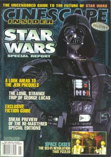
The last fake I've come across is rather unusual. It comes from the cover of a Star Wars special issue of the Cinescape Insider. If you look close, you can see this text is the same as the ROJ version, except it's backwards. This is especially easy to see on the last line. Notice that only the text is backwards; the rest of the chest box is as it should be. But there is evidence of other strangeness in the picture: there seems to be a double image of Vader's right (your left) belt box. Most curious. Why would they fake this?
Is it Hebrew?It's clear that Hebrew letters, some flipped upside down or backwards, were used on the chest boxes from ESB and ROJ. It may be difficult to recognize a resemblance at first, since most Hebrew is written in a particular cursive, almost calligraphic style. However, if you ever visit a webpage that uses a Hebrew version of the Arial font (such as this website), you'll start to see the similarity. Here's a Hebrew version of the Microgramma font, which bears a strong resemblance to many of the letters used on these chest boxes.
A few years ago, the MOM version of the text got a lot of scrutiny, and some people who know Hebrew commented online that the text was readable Hebrew, with the middle line flipped upside-down. The translation is supposedly, "His deeds will not be forgiven until he merits". Despite the compelling message of the translation, there is some debate about this. (I don't know Hebrew, but you can find more information about this translation here.) Regarding a translation, it's my opinion that these letters were probably not chosen to spell out a message in Hebrew, but rather were randomly chosen because they were unfamiliar - and therefore alien - to most viewers. The differences between the ESB, ROJ, and MOM versions point to this. And considering that the "Aurebesh" seen in ROJ during Vader's arrival is just a random string of repeating characters (which I discuss in this editorial), I'm guessing Vader's chest box says exactly nothing. Darth Jones says the same thing: "I can GUARANTEE you though that the Hebrew lettering was put on Vader's outfit just because it looked kind of different. The man who put it on for the ESB box did NOT know that Vader would turn good later on. Lucas gave no directive here."
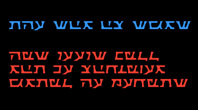
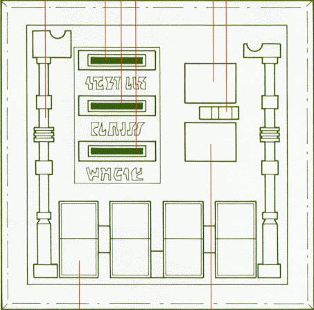
Using This Font to Recreate The VersionsUse the guide below to recreate the six different versions of the chest box:
Hope you enjoy the font. Please feel free to e-mail me if you have any different images of the text on Vader's chest box. Thanks!
|
This
page last modified on
1/23/2007
Return to Top