Disclaimer:
|
|||||||||||||||||
Galactic Basic Font
This font is based on - but differs slightly from - the Aurebesh lettering created by West End Games (see the Aurebesh alphabet here). My focus has been to accurately populate this font with letters that are seen only in Episode VI - Return of the Jedi and Episode II - Attack of the Clones. After close examination of screenshots and officially available information, many letters have been revised or replaced. (If you're interested in an in-depth analysis of Aurebesh and ROJ screenshots, see my editorial What Does That Screen Say?) The remainder of this page discusses some of the changes and uses of this font. This information is also included in the readme file contained in galbasic.zip.
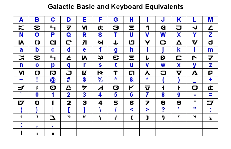
Differences in This FontTraditional Aurebesh letters that do not appear in the trilogy were replaced. These include: Grek, Jenth, Osk, and Resh. (If you don't know what any of these letter names mean, don't worry about it; this info is for the Aurebesh purists.) Grek has been replaced with a modified version of Enth. Osk has been replaced with Orenth. Resh has been replaced by Nen. Jenth has been replaced with an entirely new letter, which I refer to as Jul. All other letters have been severely modified for accuracy. Arabic numerals (1,2,3, etc) have been used in the font, since Arabic numerals were used in the original trilogy. Here's a full table of Galactic Basic letters and their respective keys.
NOTE: This font is simply a personal interpretation. It will not allow you to translate anything seen in the movies. I apologize if your favorite letters have been changed or removed.
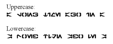
Use of This FontIMPORTANT: There are two distinct sets of letters in this font - uppercase and lowercase. Uppercase letters are "rightside up" letters, resembling the familiar Aurebesh. Lowercase letters are upside-down (rotated 180 degrees) versions of their uppercase counterparts. This was done so you can create upside-down words, which often appear on screen (especially all over Coruscant in Episode II).
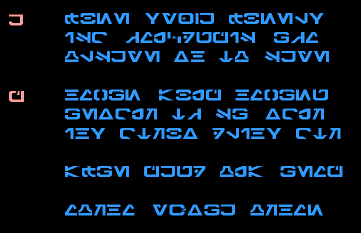
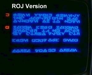
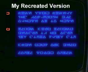
To recreate movie-accurate text, uppercase and lowercase should not be mixed on the same line, and you should not use capital letters with lowercase. Here's the famous screen from ROJ, followed by a recreation using my Galactic Basic font (in all caps):
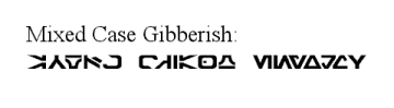
If you're simply looking for visually-appealing letter combinations, mixing upper and lowercase can be quite effective:
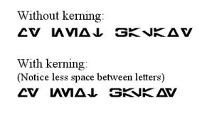
Reducing Spaces Between LettersBecause of the shapes of many of the letters, unsightly spaces have a tendency to form in the middle of words. To correct for this, I have adjusted the kerning for many of the letters so that they fit more closely together.
However, this kerning is not automatic; it must be turned on in the text program you are using. For example, to enable kerning in Word, select Format, Font, Character Spacing, then enable "kerning for fonts".
Legal Mumbo JumboThis font is not officially licensed and is not intended to infringe on any copyright. This font is freeware; it may be distributed freely, but PLEASE distribute all files included in the ZIP archive. This font is NOT to be sold or used for financial gain. Help keep it free and available!
|
This
page last modified on
8/25/2006
Return to Top